


This week sees the book getting officially launched on Wednesday. This week I’ll be doing a series of five posts about the interior art. Comment on a post to be entered to win one of three pieces of Near + Far jewelry; comment on all five posts and you’ll be entered five times.
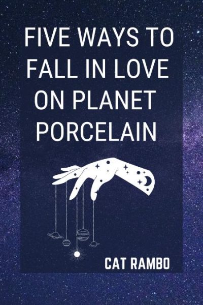
So left to right above are five of the interior illustrations from the book. One of the things Mom said to me last night was how much she was enjoying the afternotes, so I’m trying not to repeat those too much, but to add a touch more to them.
Leftmost is a star like pattern, which accompanies far future story “Timesnip,” in which 18th century Victoria Woodhull copes with life in the future as a traveling saleswoman dealing in time travel. It’s actually a version of one of the other illustrations, arranged in a star cluster, which mark didn’t point out to me till later. That seems very fitting, given the circularity of the story.
The second pattern is one that accompanies the story “Amid the Words of War.” Its cramped interior echoed the desperation on Six’s part that I wanted to convey over the course of the story. The story is about war and conflict and the distrust they force on each other. The pieces in the book are black and white and here Mark’s chosen to create a white “eye” for a number of the illustrations which (to me) just adds to the coolness and makes each one become a creature presenting itself sideways to the camera.
The third design accompanies the story “Kallakak’s Cousins”. Again, there’s that eye looking out, and sometimes it’s a creature and sometimes a face, sometimes a helmet built of butterflies and submarines.
The fourth accompanies a flash piece, “Futures.” It resembles a submarine, or perhaps a rocket ship, although once more there’s an eye, set dead center in this case.
The fifth is used with the slipstream afterlife story, “Bus Ride to Mars.” It’s one of Mark’s older pieces, a sideways slash of a piece that appears differently in here than in the book itself.

")


12 Responses
I was looking at these today and the details are so rich and gorgeous, yet simple at the same time, much like your writing.
Wow, this is great Cat. I can’t wait to both see and read the book! I like the way the designs evoke the essence of Hindu and/or native indigenous art. Very well done!
Love these, and wish I had all five. I like the blue to green background gradient, which sets off the ink drawings so well. I think my favorites are the rocket ship fourth one, and then the eight point star first one. Congrats on Wed book send off!
Those are lovely pendants. I like the feel of them. I’d be happy to wear one.
I love sci-fi and so do my daughters, so we can’t wait to read your Near + Far! The jewelry is sooo cool! I am very excited for you, Cat!
You’ve inspired me to try working with epoxy resins in my jewelry making. I love the look of these.
Mark and I have really been having fun with the resin. I’ve been making some pieces with bottle caps as well.
Love them! What a fantastic idea. If you want to do a giveaway, I’m game. although I’d want to give away to myself. hahaha.
I meant if you want to do one on my blog. doh. And now I’m at least entered once myself.
Totally happy to provide one for a giveaway on the blog! Mail me what you would need – jpgs of the covers?
Beautiful pieces, and what a fun idea!
I really like the visual cacophony of #3…guess I’m not all about the fives today after all, although #5 is a close second for me. It looks like an idealized, mechanized beetle.
Each piece is this series is highly evocative. Wonderful work by Mr. Tripp, and I’m sure the stories they’ve been paired with are equally delightful.